Acuto Studio
Acuto Studio
Acuto Studio
Acuto Studio
Acuto Studio
Looking sharp
Looking sharp
Looking sharp
Looking sharp
Looking sharp
Brand Identity
Brand Identity
Brand Identity
Brand Identity
Brand Identity
2020
2020
2020
2020
2020
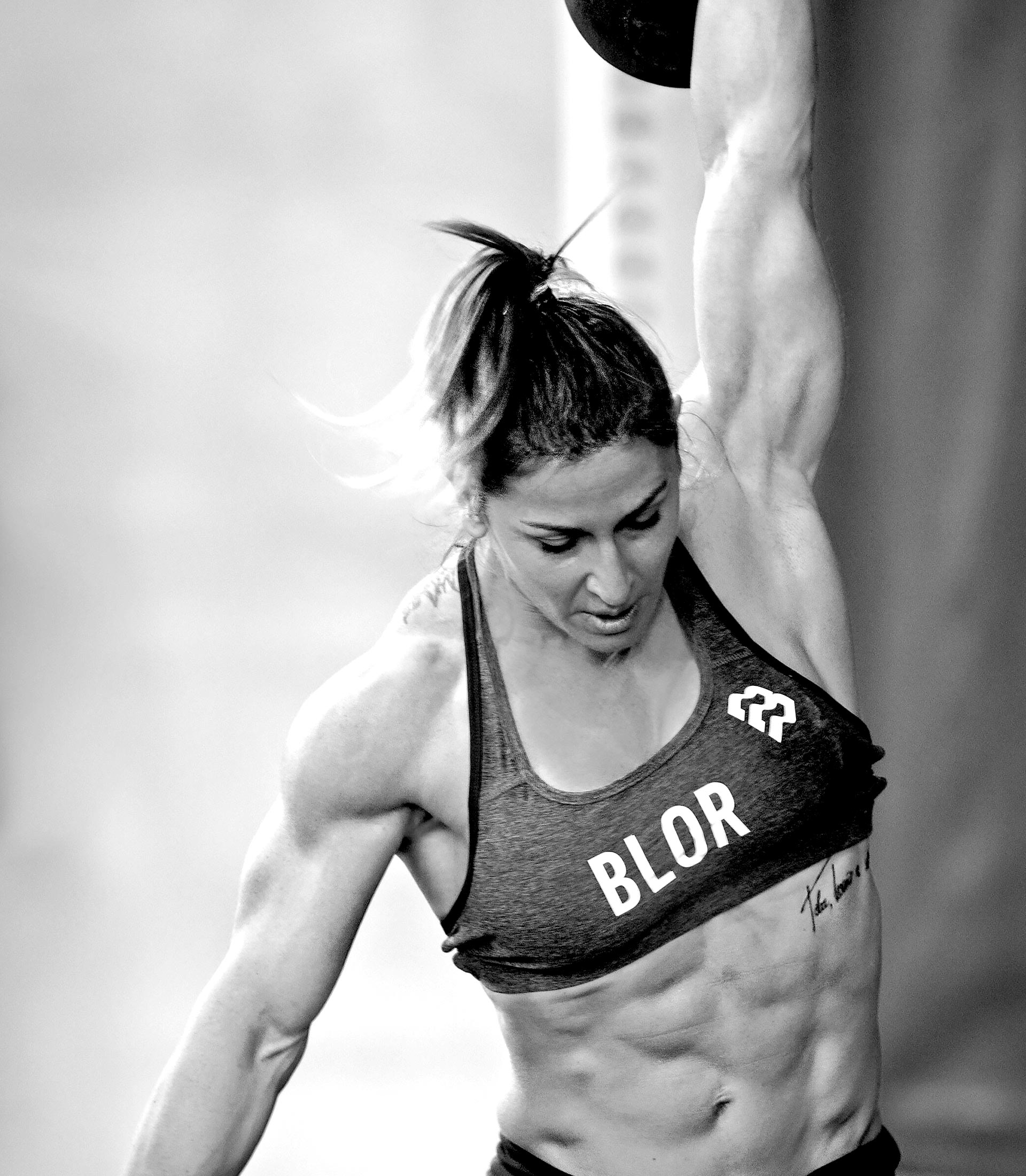
Riccardo Testi is a photographer who primarily shoots athletes and competitive sport. He approached me to design and create a strong name and identity to match.
Acuto, meaning sharp in Italian, is distinct and references Riccardo’s heritage. The icon is an abstracted letter A. Built from sharp geometric shapes, the icon is simple and can be used as a graphic frame or as a pattern. The workmark continues the sharp edges and boldness, using contrasting colours, the identity helps to position Acuto as a professional photography studio in the sports industry.
Riccardo Testi is a photographer who primarily shoots athletes and competitive sport. He approached me to design and create a strong name and identity to match.
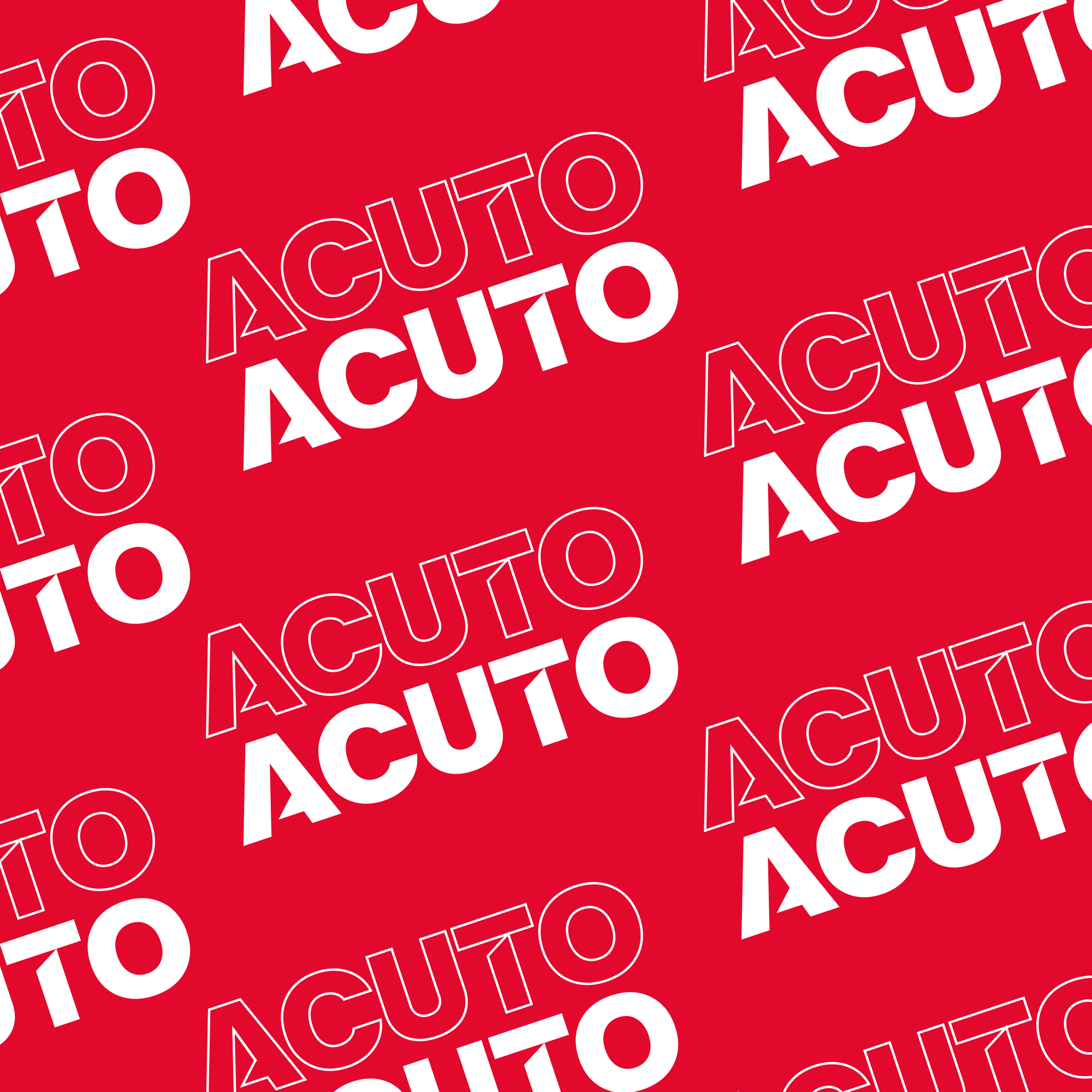
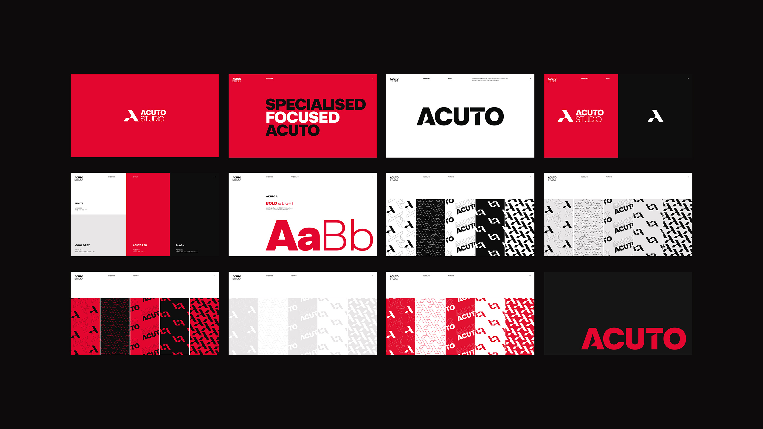
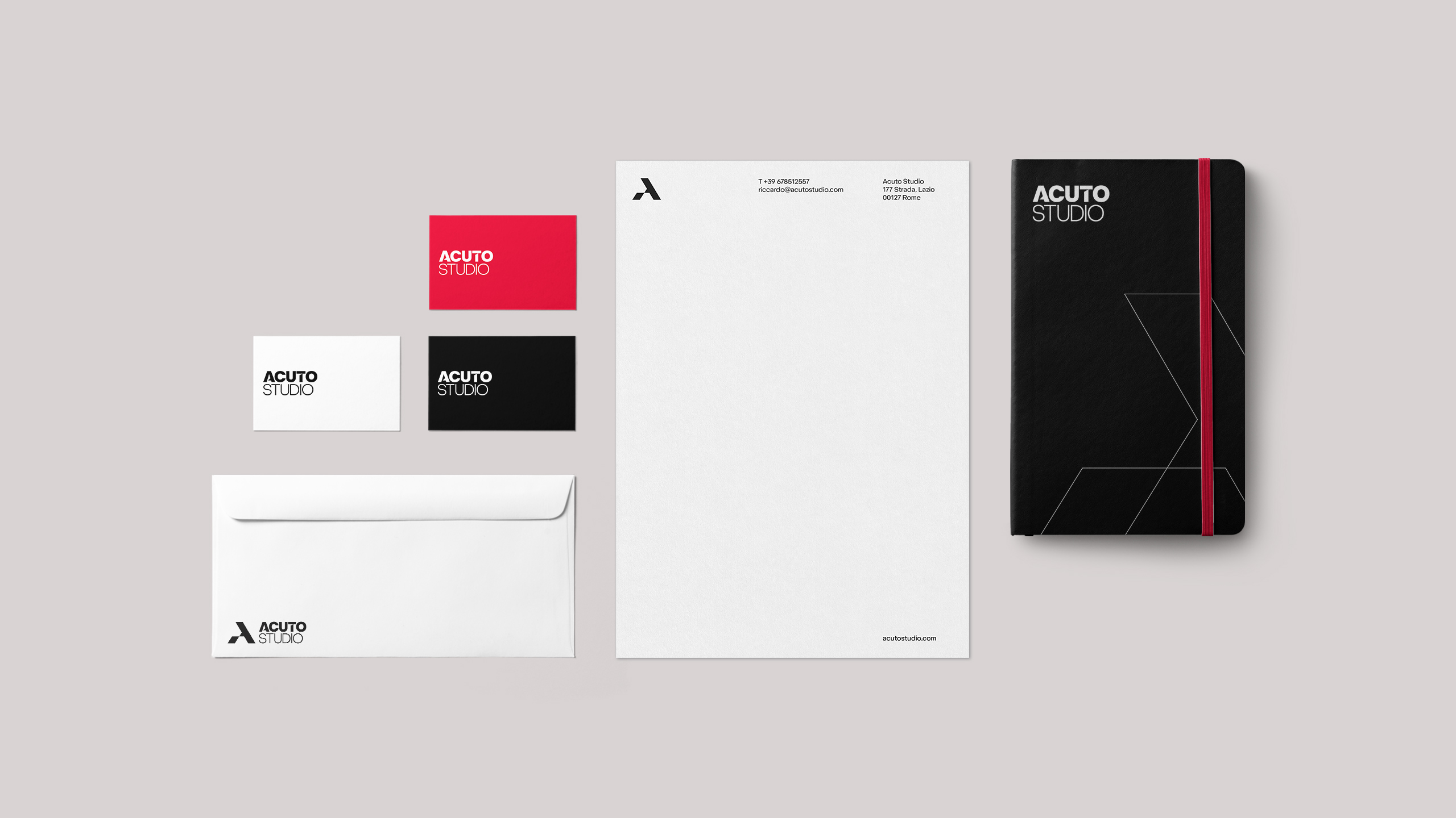
Acuto, meaning sharp in Italian, is distinct and references Riccardo’s heritage. The icon is an abstracted letter A. Built from sharp geometric shapes, the icon is simple and can be used as a graphic frame or as a pattern. The workmark continues the sharp edges and boldness, using contrasting colours, the identity helps to position Acuto as a professional photography studio in the sports industry.


Got a project in mind?
Got a project in mind?
Got a project in mind?
Got a project in mind?
Got a project in mind?
© MinalStudio 2022
© MinalStudio 2022
© MinalStudio 2022
© MinalStudio 2022
© MinalStudio 2022